Assignment: Use the brand’s visual identity and approved messaging to design a multi-channel advertising campaign.
Technology: Adobe InDesign, Photoshop, and Illustrator.
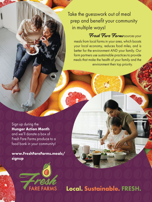
Description: The multi-channel advertising campaign for Fresh Fare Farms required tailoring the same message and style to advertising pieces for print, social media, and web. The magazine and social media ads use brand-approved shapes to create text areas and clipping paths for the images. In the magazine ad, which was created in InDesign, hierarchy is created primarily through the position of the different elements. The darker background color on the bottom shape was used to help anchor the page and provide excellent contrast for the brand logo. A pattern of repeating shapes was added to give the impression of texture and elevate the overall design. The background image was selected both for the pattern of repeating fruits and for its warm color palette, which is like the brand’s color palette. The same style was brought to the social media carousel ad, created in Illustrator, which uses its own images for the background and foreground of the three panels. In this ad, different elements flow through the three panels, directing the viewer through each part of the message. The images for this ad were also carefully selected to match the warm tone of the brand’s color palette. The last piece of the multi-channel campaign is a web banner which, though simpler in design than the others, blends seamlessly with the different components of the campaign.
Assignment: Use the brand's visual identity to create magazine and web banner advertisements.
Technology: Adobe Photoshop
Description: The magazine ad was created with 5 different photos: the snowy urban landscape, the ocean and sky, 2 images of palms, and the woman and pool. Each of the images required extensive masking, color, and contrast manipulation to work together as a single image. The woman and pool image also had to be widened, which was done manually by dividing the image into three vertical areas and stretching the two outer areas to the desired width then seamlessly blending the areas together again. The web banner was then created using some slightly modified versions of these images.
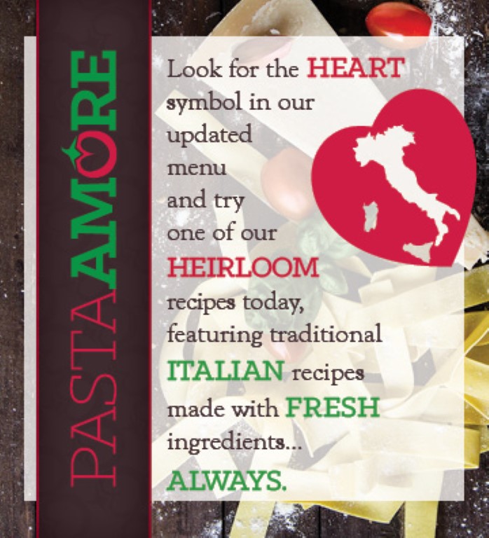
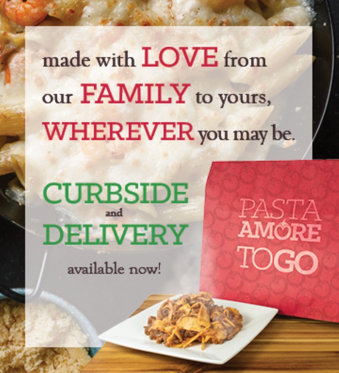
Assignment: Use the brand's visual identity to create a new menu, table tent advertisement, and take-home brochure and present the new items to the client.
Technology: Adobe InDesign, Photoshop.
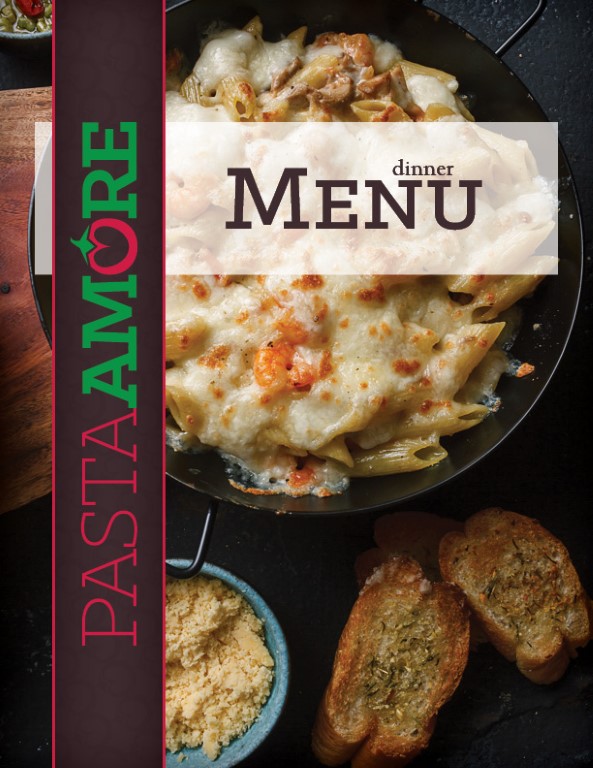
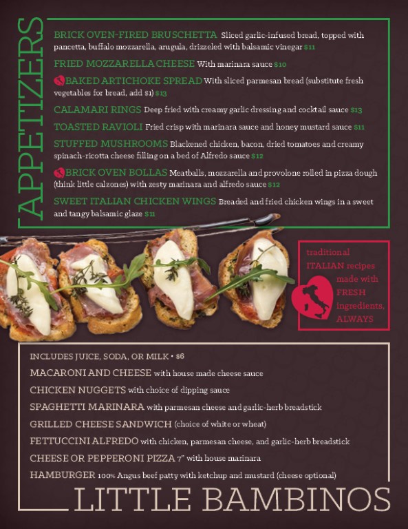
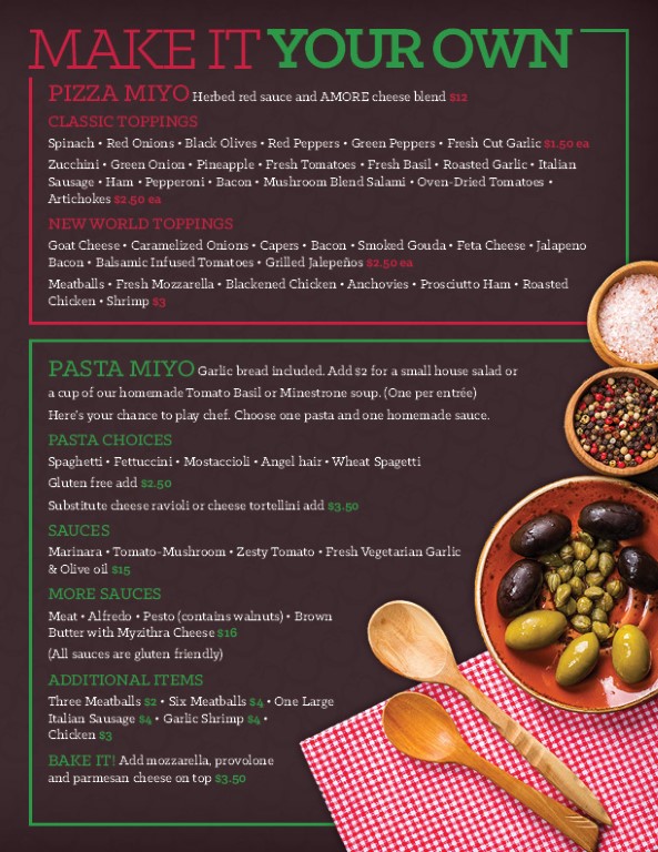
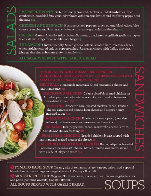
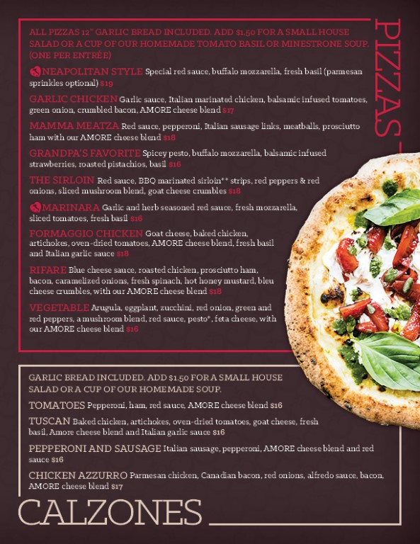
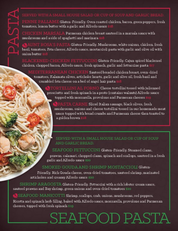
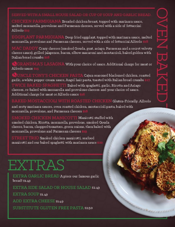
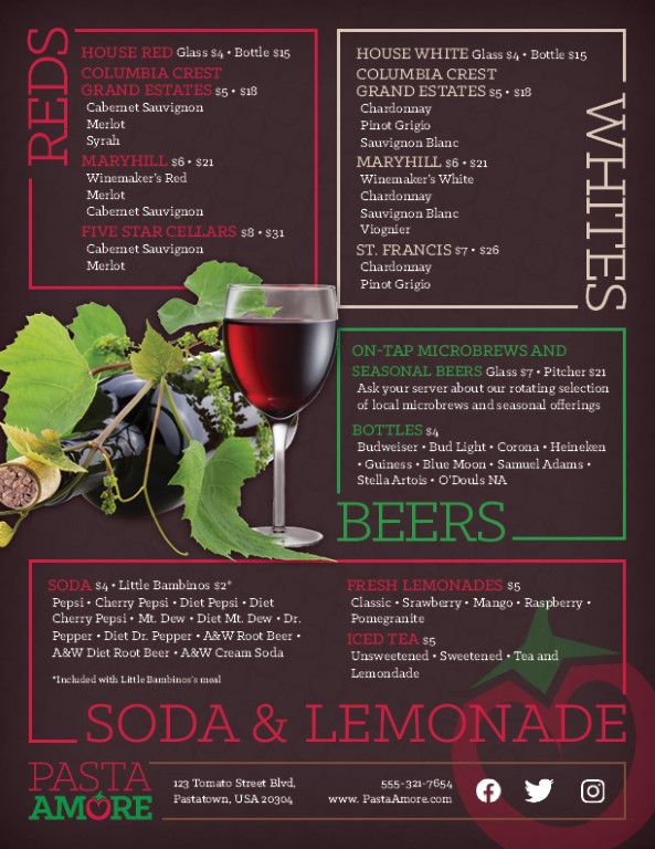
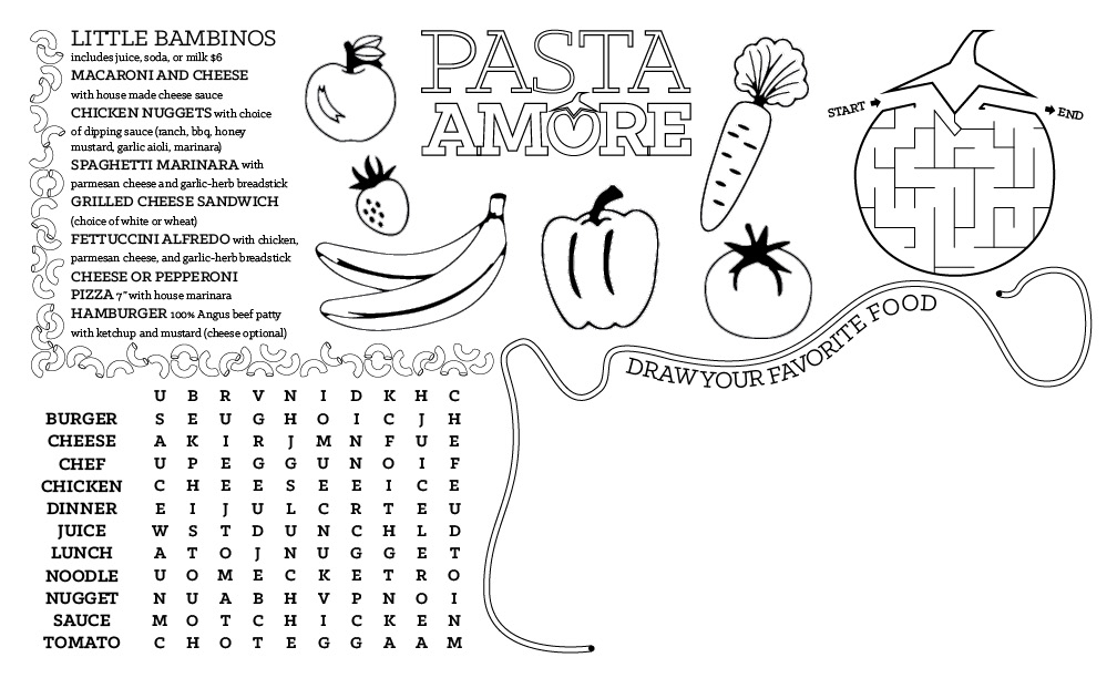
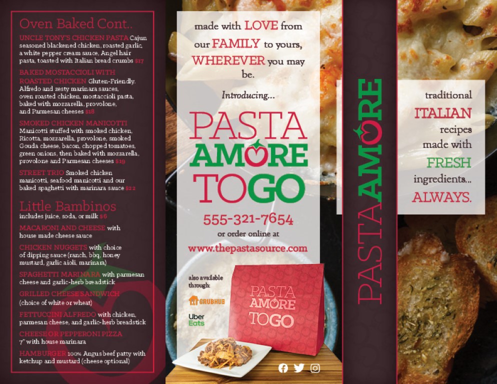
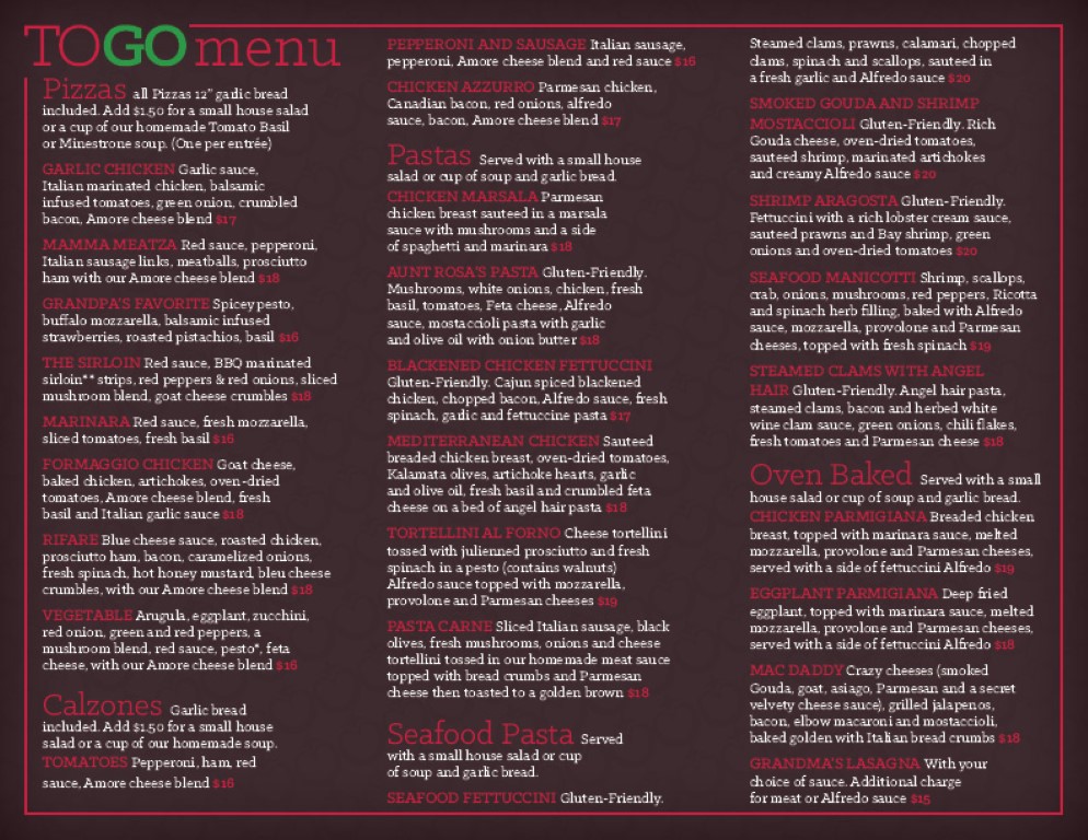
Description: The Pasta Amore collection is another example of print design, consisting of a restaurant menu, kids’ menu, table tent, and a take-home brochure. Working with a pre-determined brand style, the collection represents the fictional brand in a way that is bold, modern, and sophisticated. The patterned background with a dark vignette lends to the sophisticated feeling of the collection, while brighter foreground elements create a nice contrast between themselves and the background. Lines that play off the strokes of the main typeface help to create clear divisions between sections. Color matching the border, label, and item names creates cohesion within each group and differentiates the groups from each other. Each page has been carefully laid out using Adobe InDesign, paying close attention to the different page and section margins to ensure a clean and polished appearance. While the page and section margins follow a mostly rigid structure, mouth-watering images boldly interrupt this rigidity. Requiring extensive masking in Photoshop, these images were selected to represent the contents of their respective pages. In the various pieces, type was strategically used to create emphasis on brand values and a special children’s menu was created to emphasize the brand’s focus on family.
These items were later used to in the creation of a web page that can be viewed here.
Full PDF Presentation
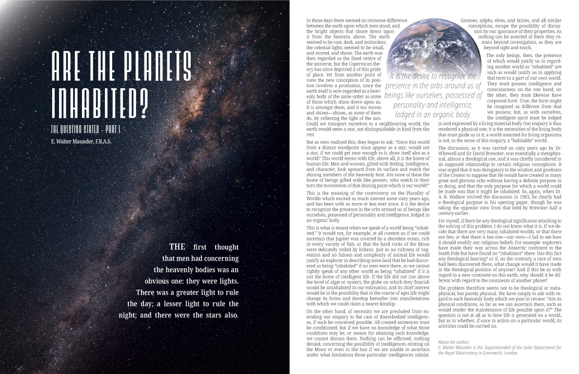
Assignment: Create a readable, two-page magazine spread of the article "Are the Planets Inhabited" using Adobe InDesign
Technology: Adobe InDesign
Description: This magazine spread was designed around the beautiful cover image. Special attention was paid to the alignment and position of the article title and beginning sentence to work with the line created by the Milky Way in the photography, which divides the two elements. Additionally, the body of the article was wrapped to the round globe to add interest to the page with a pull quote to bring the reader in. Working within a two-page document restriction, a great deal of attention went into fitting the article into a single page, including fine adjustments to the tracking, kerning, and line-height.
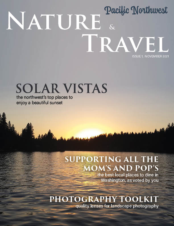
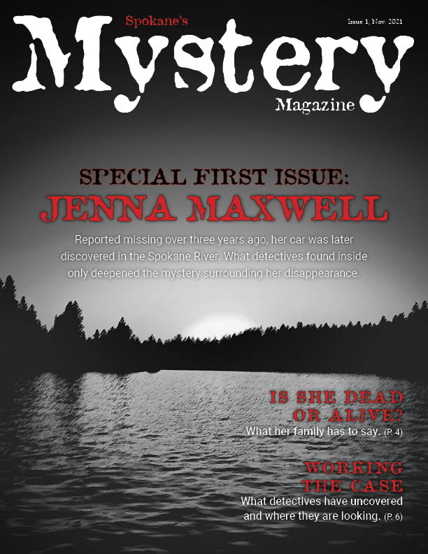
Assignment: Create a pair of magazine covers using images and type to establish the tone of the content.
Technology: Adobe InDesign and Photoshop.
Description: These examples of print layout design were assembled in Adobe InDesign and some of the photographic components were prepared using Adobe Photoshop. In the two magazine covers are an exploration of how imagery and typography can set a particular mood while using the elements of design to create a visually compelling and readable layout. The original, high contrast background image was used in conjunction with different sized and styles of text to divide the information on the page into sections. The magazine titles and feature articles were placed above the horizon line while the titles of additional featured articles were placed below the horizon.